Senior Product Designer | Jitjatjo | May 2019 – September 2020
Overview
Jitjatjo provides on-demand staffing solutions for the hospitality industry through a suite of digital products. As the company expanded, its design ecosystem became fragmented—each product followed different visual conventions across iOS, Android, and web.
In mid-2019, a brand overhaul presented an opportunity: to unify our product suite under one cohesive design language. As Lead Product Designer, I led the creation of a scalable design system and the redesign of key interfaces, including a new enterprise-grade web platform for Ondemand.
The challenge
Jitjatjo’s design ecosystem was fragmented, with three core products following inconsistent design patterns across platforms. The new brand introduced a restrictive colour palette, limiting flexibility. As the company scaled, there was growing pressure to support enterprise clients with a robust web-based solution—all under tight timelines for both design and engineering teams.
The approach
Together with the Head of Design, we made the bold decision to pause feature development and focus on foundational work—building a cross-platform design system guided by the new brand principles.
We prioritised customer-facing apps (Ondemand and Flex), applying the system to mobile before scaling it to the internal web tool (Dash).
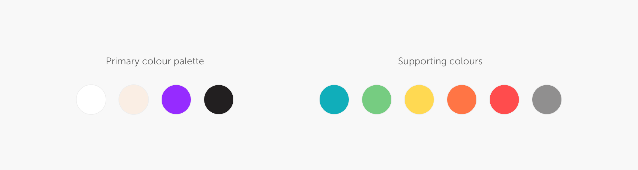
Visual strategy
We evolved the limited brand palette to support digital accessibility and usability, expanding it with complementary shades and neutrals for flexibility.
Brand values → product expression
We then looked at the brand values and did our best to apply those to the new design system. Since Jitjatjo is a human powered company, this is the message we wanted to convey with the new brand. And to translate that concept through our designs we used the following approach:
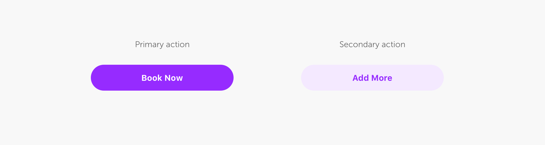
Focus through clarity: Ample white space reduces cognitive load in high-stress hospitality settings.
Purposeful colour use: Brand purple is used sparingly to draw attention and inspire action.
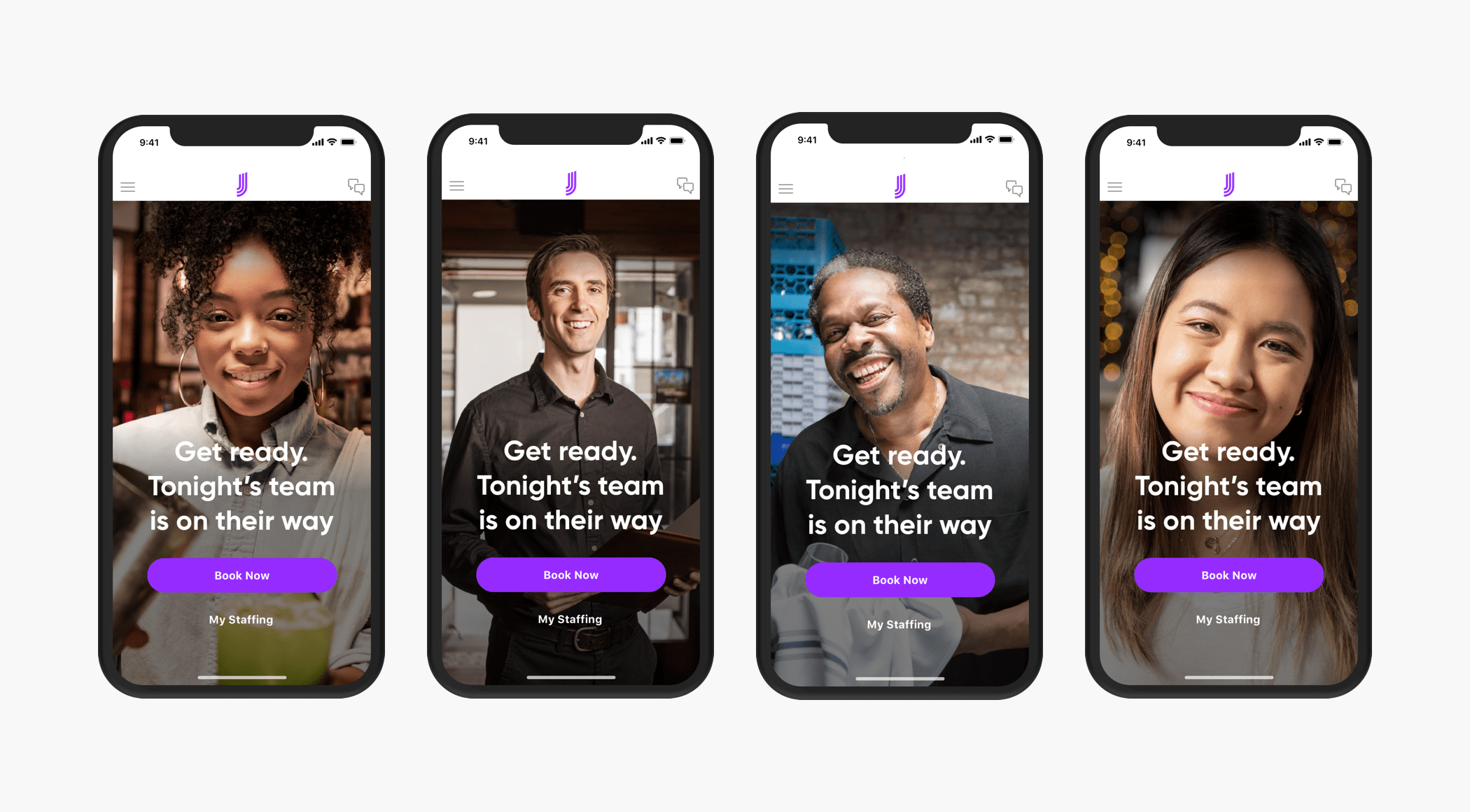
Human-first design: Hero images of real talent, not stock photos, rotate on login.
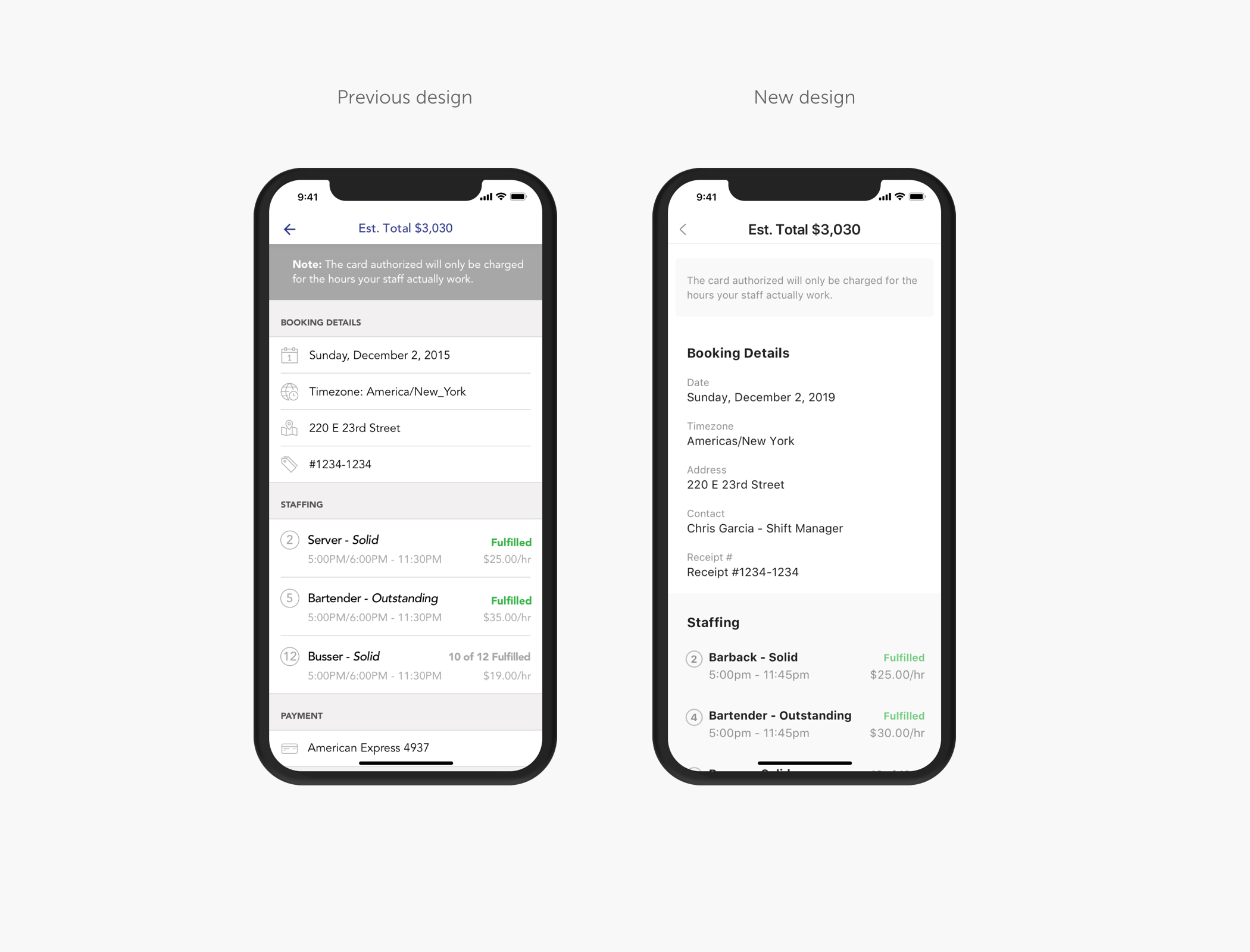
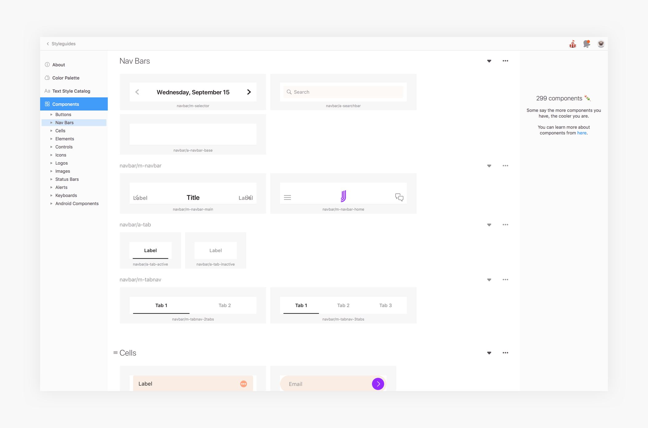
Component architecture
Using principles of atomic design, we built a reusable component library that enabled scalable design and development. Components were documented in Zeplin—our single source of truth—reducing engineering ambiguity and duplication.
The final result
The redesigned components were applied across both apps, resulting in a cleaner, more modern, and cohesive user experience.
Impact of the Design System
Reduced design inconsistencies across iOS, Android, and web.
Enabled faster rollout of features with shared components.
Improved visual coherence, contributing to stronger brand perception.
Increased design and engineering efficiency through centralised documentation.
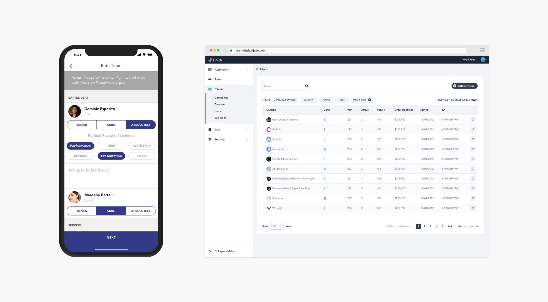
Designing the Ondemand Web Platform
Why Web Was Critical
Ondemand began as a mobile-first product for small businesses to book staff. As Jitjatjo grew, so did its customer base—multi-venue operators and event companies needed more robust tools to manage multiple bookings daily, something the mobile app couldn’t support.
Research and Insights
To understand enterprise needs, I conducted 5 remote user interviews with support from the customer success team. Participants included managers at multi-site venues and catering operations.
We also performed a competitive audit to identify UX gaps and opportunity areas.
Key learnings
Booking multiple jobs via mobile was inefficient.
Managers needed a quick overview of upcoming jobs and staff assignments.
The person creating bookings often wasn't on-site, so remote clarity was crucial.
Designing the Solution
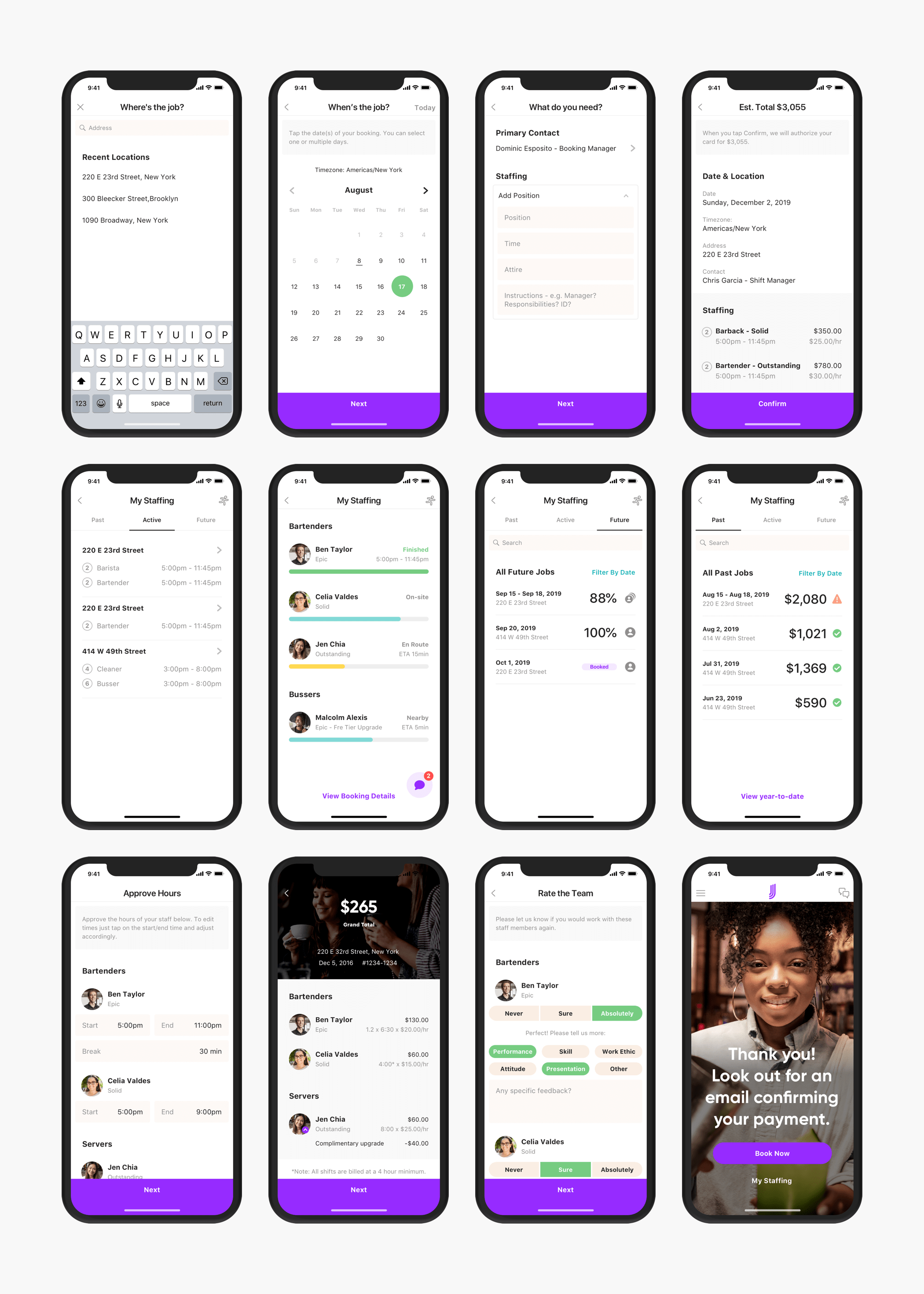
I collaborated with the PM to map flows that mirrored mobile functionality while optimising for desktop needs. The goal: allow power users to complete complex tasks quickly.
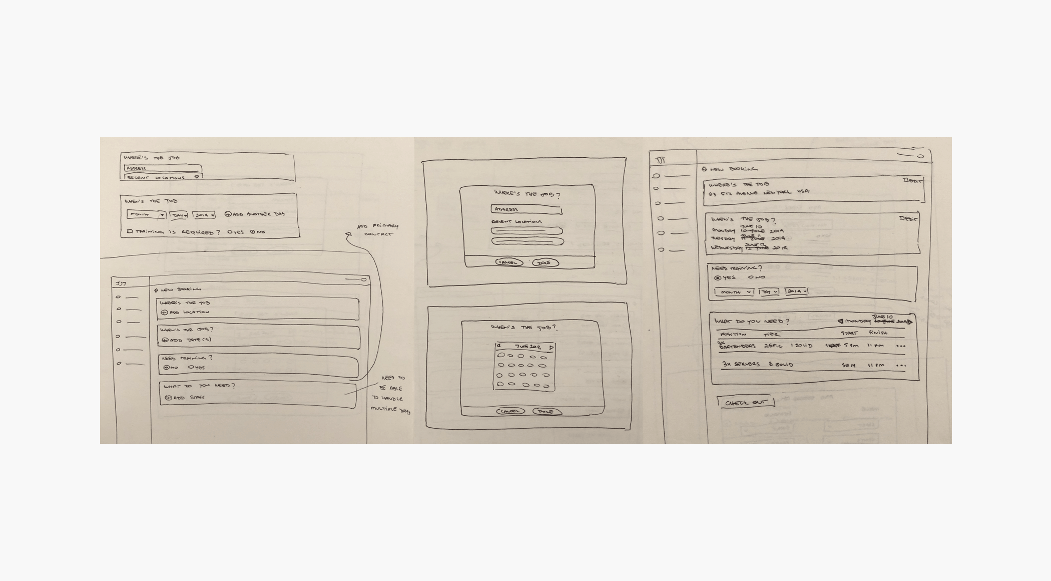
I began with low-fidelity sketches to explore layout and interaction models. Once directionally aligned, I created high-fidelity mockups using our new design system.
Early concepts & testing
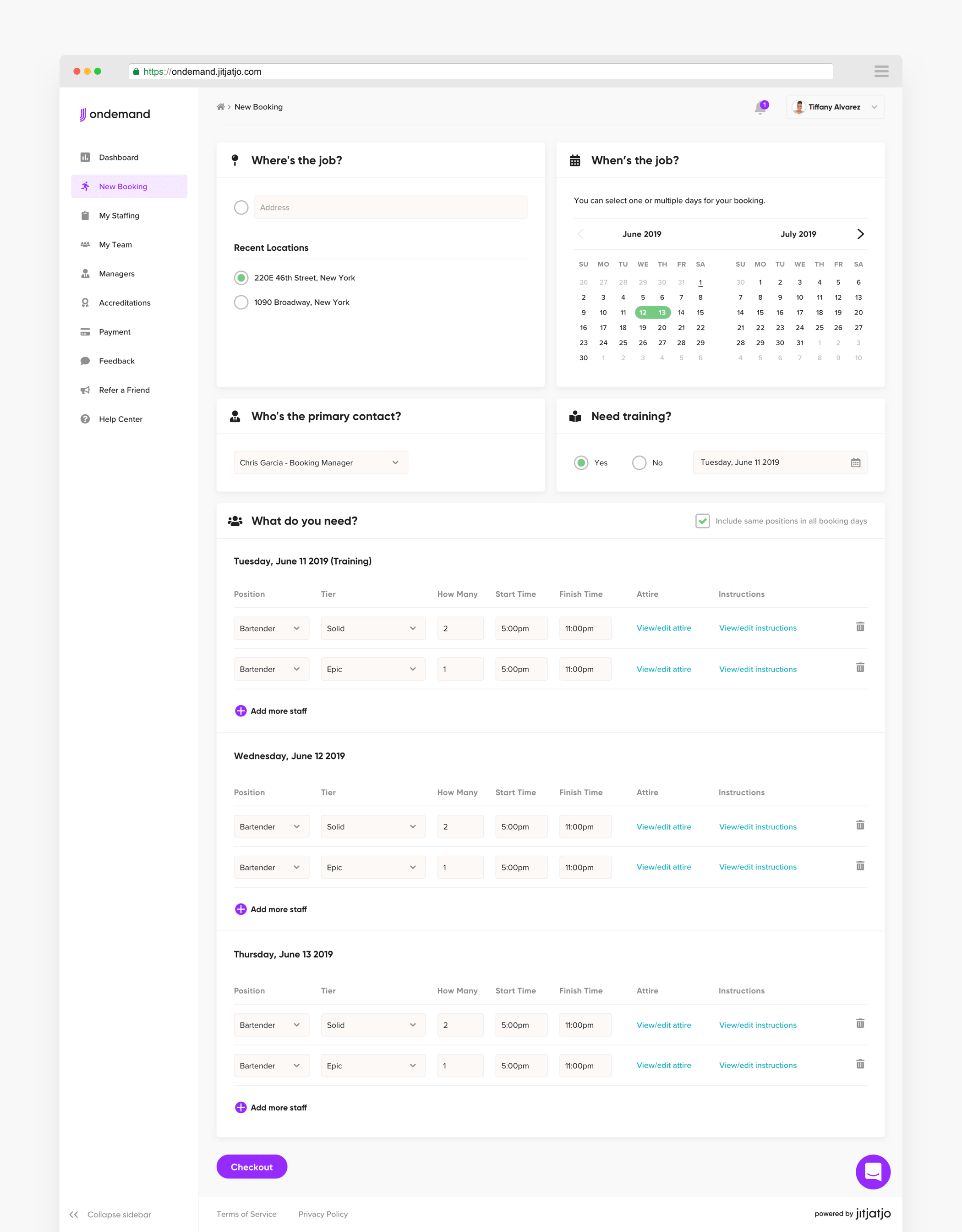
To improve usability for high-volume users, I introduced a single-page booking flow that replaced the multi-step process used in the mobile app. Key booking details—such as staffing requirements, time slots, and roles—were made easily editable in one view.
Feedback from users
Initial usability testing, conducted via Lookback, surfaced several points of friction. While users appreciated having all booking components visible in a single view, the modal-based editing experience felt slow and disconnected. Many also struggled to locate staffing tools and found it difficult to navigate between dates when managing multi-day bookings.
The final solution
In response, I iterated on the design by introducing inline editing and simplifying interaction patterns. These changes were well received in follow-up testing, significantly improving usability and overall user satisfaction.
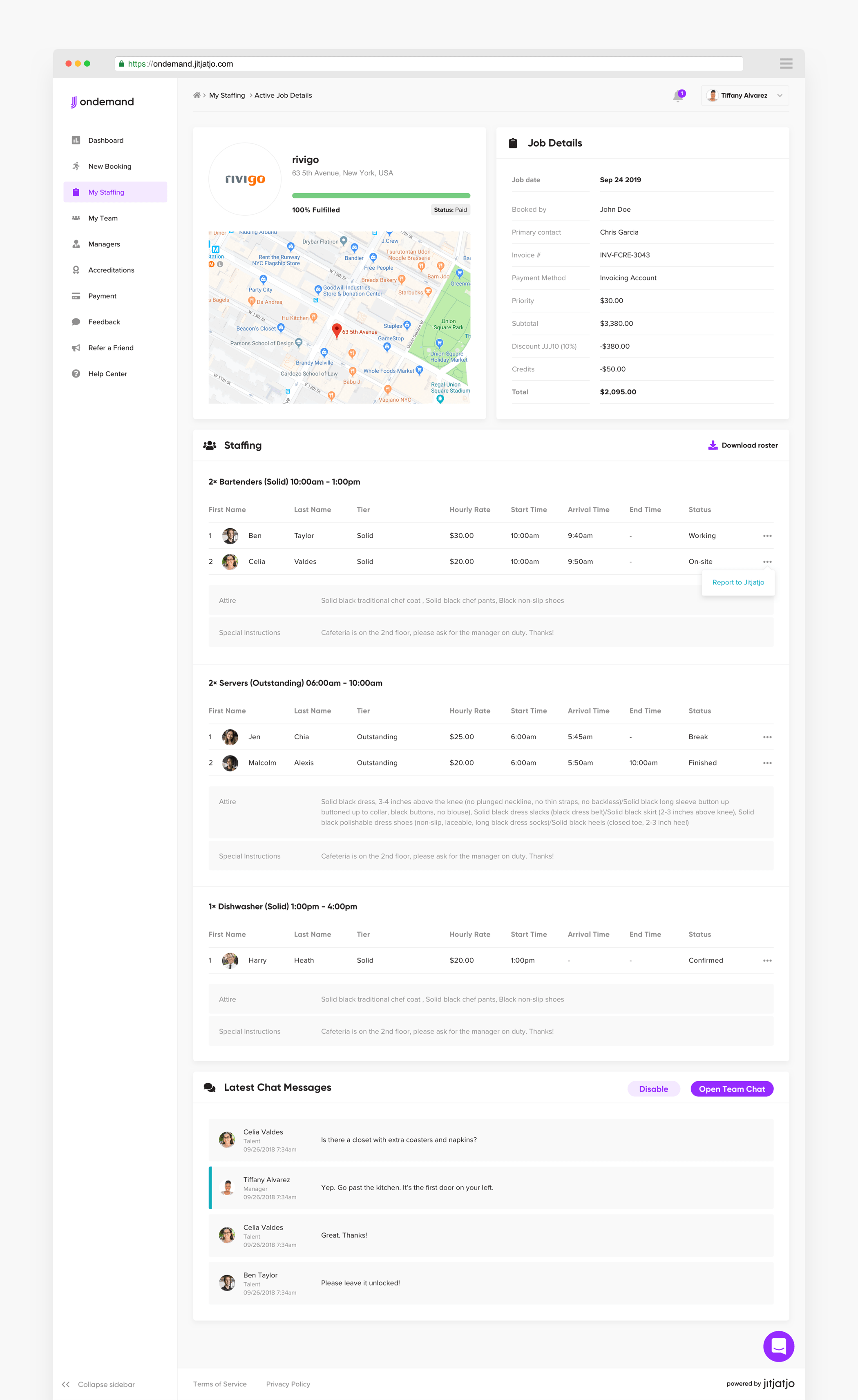
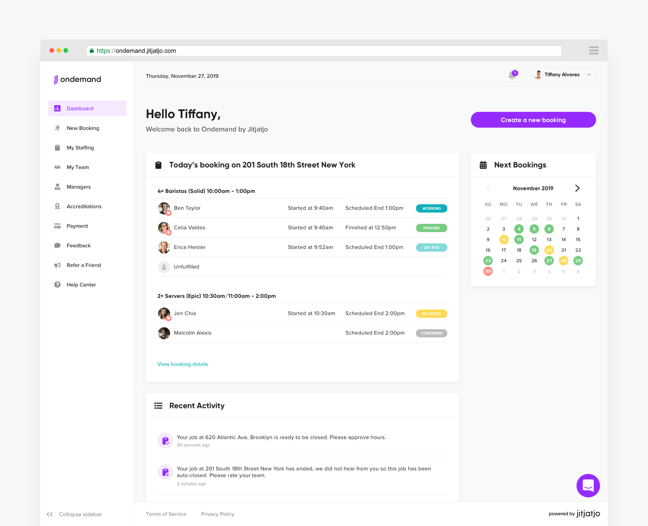
Unlike the mobile app, the web experience required a home screen, so I designed a dashboard showing upcoming bookings, a calendar view, and recent activity—based on insights from initial research.

Outcomes & results
Streamlined booking flow reduced time to create multi-day bookings.
Users reported greater confidence in managing high volumes of jobs.
The new dashboard empowered users with a clearer operational overview.
The web platform helped support the onboarding of larger enterprise clients, contributing to business growth.