Lead Product Designer | Tyro | March – December 2017
I worked at Tyro from February to December 2017 as the Lead Product Designer on their mobile business banking app.
Tyro has been providing EFTPOS payment products to customers since they launched. In 2016 Tyro saw an opportunity to provide banking services to small businesses and built a bank from scratch, being the first tech company in Australia to earn a banking licence.
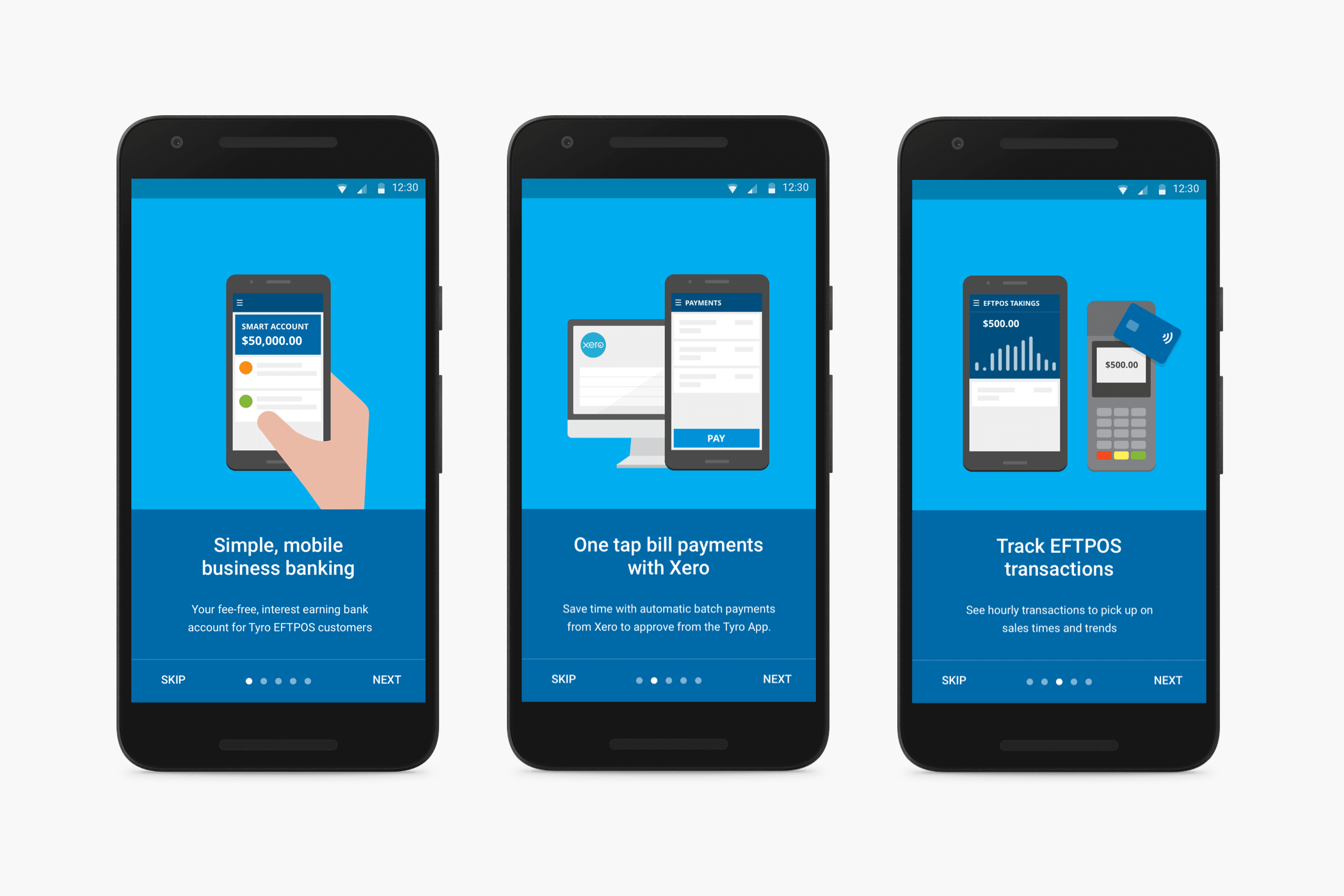
Tyro Banking App
Design System
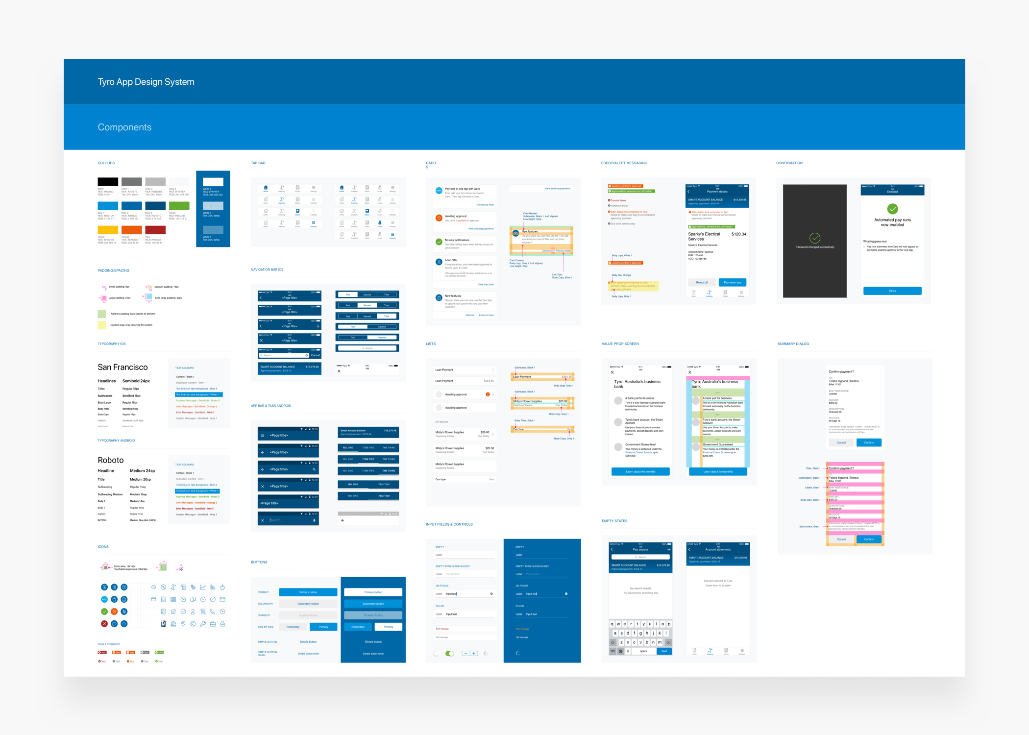
While at Tyro I helped make several enhancements to the iOS and Android apps. When I joined, there were a lot of design inconsistencies across the two platforms, since they had different designers looking after each platform previously.
One of first the initiatives I got involved in was creating a design system for the app and making sure all components were consistent across both iOS and Android, while respecting platform specific differences. After all components were created I documented the usage of each using Confluence.
Redesigning the EFTPOS feature
With the Tyro Banking App, as well as being able to view their account balance, make transfers and payments, and applying for loans, Tyro customers are also able to view the EFTPOS takings that come in every day through their payment terminals.
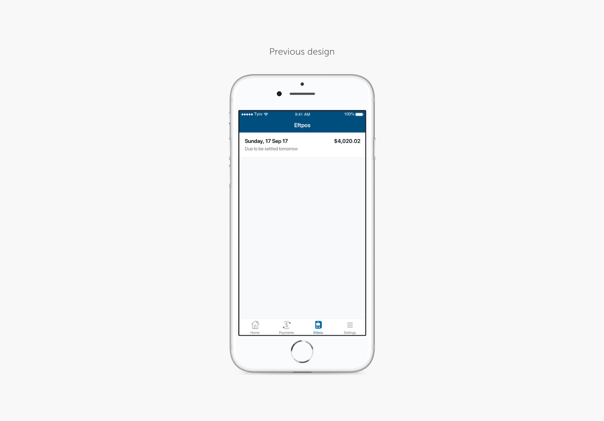
The previous version of this feature was very simple. It only allowed customers to view the total sum of their takings, regardless of how many terminals they had. The information provided wasn’t exactly useful.
This was a problem particularly for customers with multiple locations as it was impossible to identify how much of the total amount belonged to each location. After receiving this feedback from several customers we thought it was time to come up with a better solution.
Ideation workshop
At the start of every project at Tyro I always set up a design workshop which included most of the team involved in the project, members in product, design and engineering.
I started every workshop by going over the problem statement in detail, and any research insights with the help of the UX Researcher. We’d then move on to a sketch session where every team member would have the opportunity to sketch and present their ideas for potential solutions.
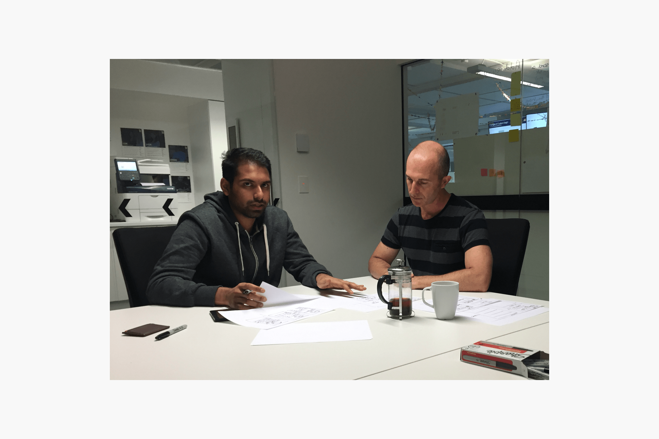
At the end of the session I’d get the team to vote on their favourite ideas. I’d then use the ideas with the most votes as inspiration to get started on the design process.
I felt that getting the team involved in generating initial ideas at the very start of a project was extremely valuable, especially in such a tech-driven company. This helped engineers see the value in design and also feel they’ve contributed to ideas.
Initial designs
Following from the ideation workshop I moved on the design phase and started with sketching out some initial ideas for solutions.
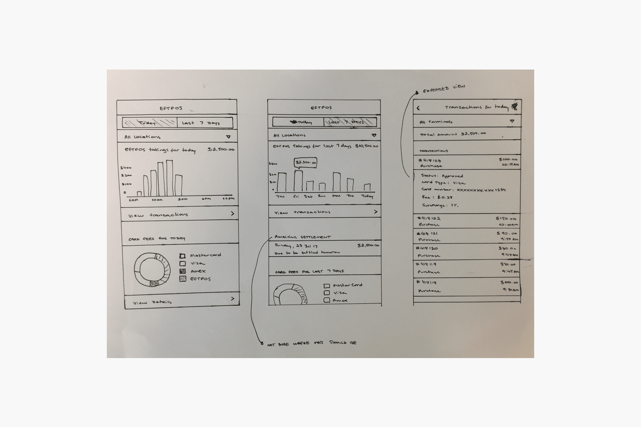
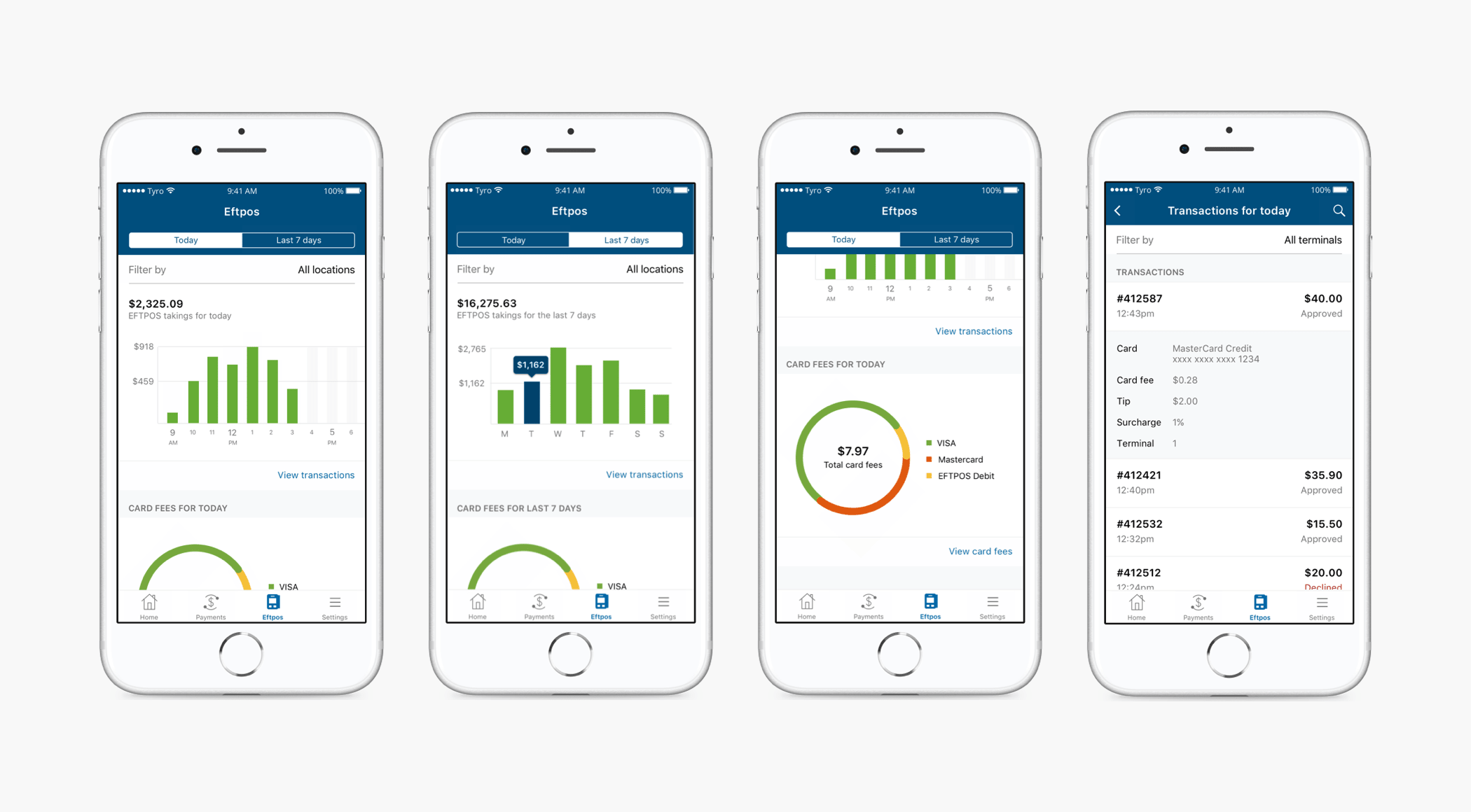
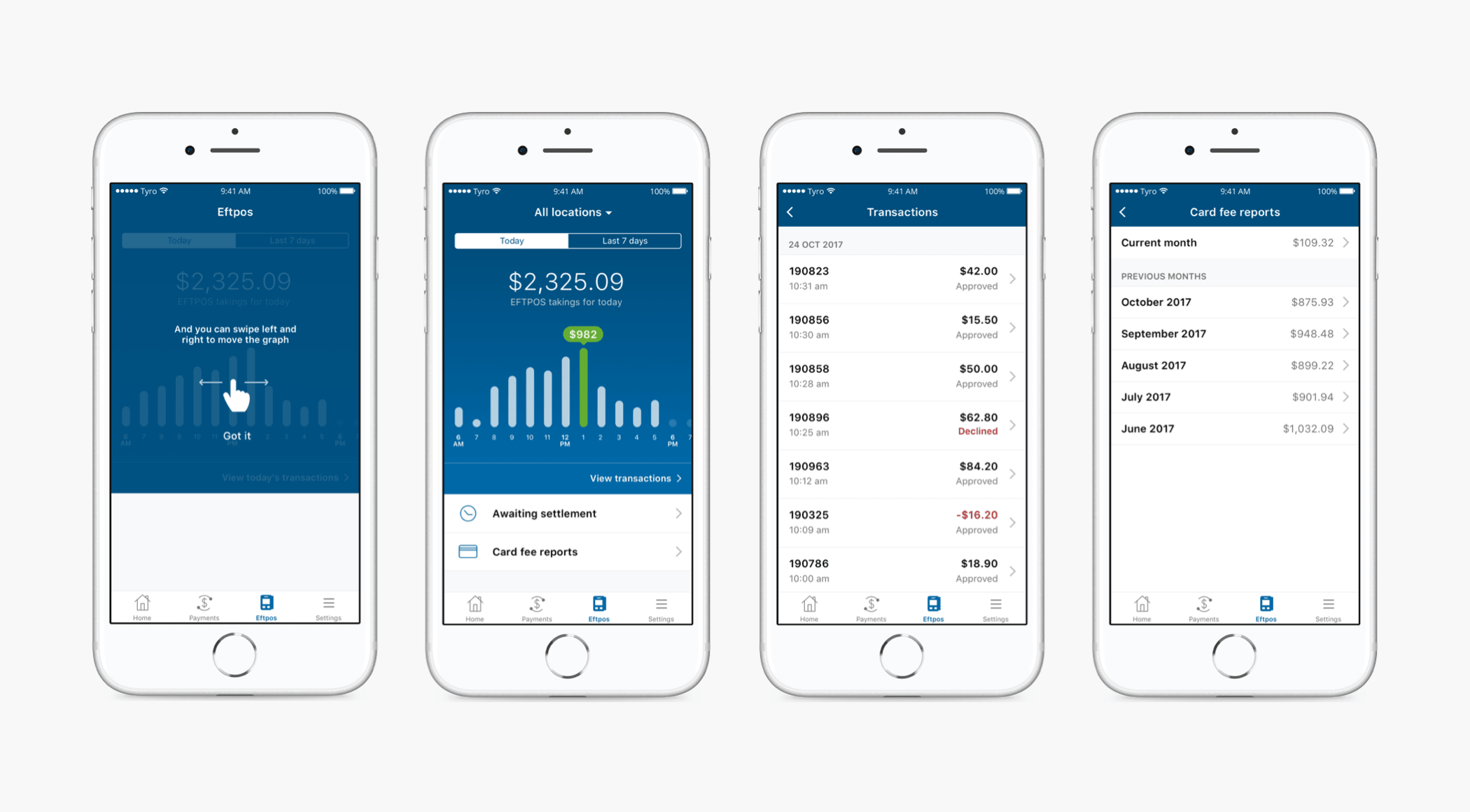
Using the existing design system I moved on to creating the first round of designs for usability testing. The updated feature would allow customers to see their EFTPOS takings per location, as well as having a real-time view of their takings per hour and over 7 days, individual transactions, and information on card fees, which wasn’t readily available to them previously.
I chose to represent the hourly EFTPOS amounts in a graph format to make it easier for the user to understand where they’re at throughout the day. I wanted the graph to be interactive, so when tapping on the bars the user would be able to see the exact amounts, and the graph would also be scrollable.
Feedback from users on initial designs
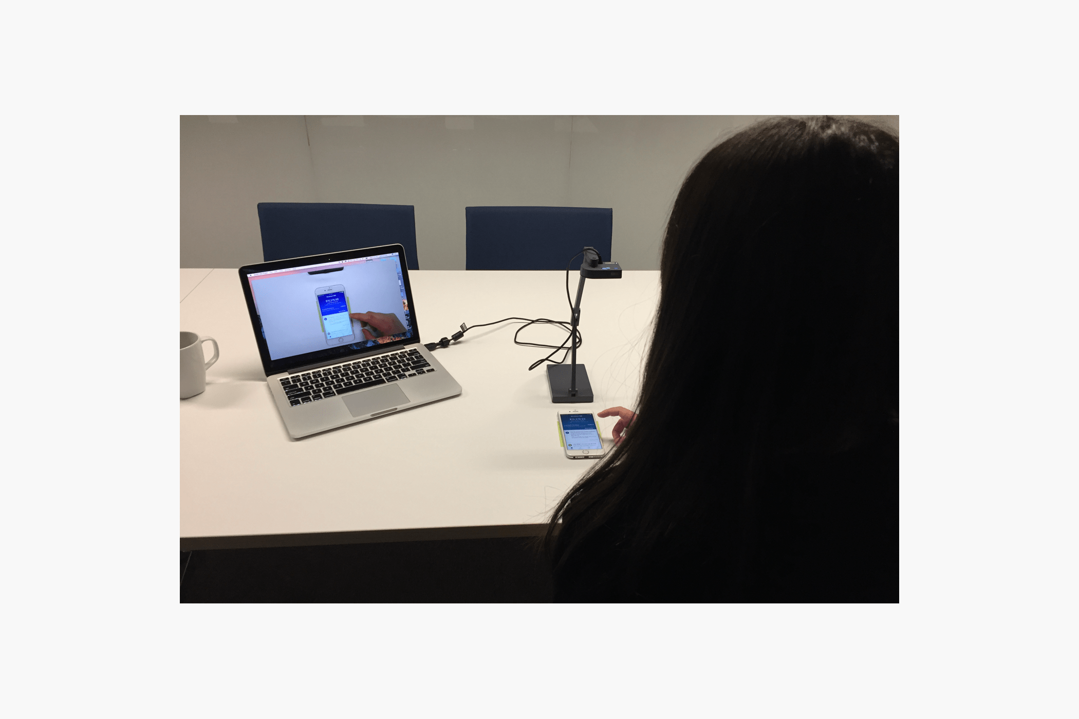
I set up usability testing sessions with 6 customers to validate the initial designs. While I ran the sessions I had other colleagues listen and take notes to help gather feedback.
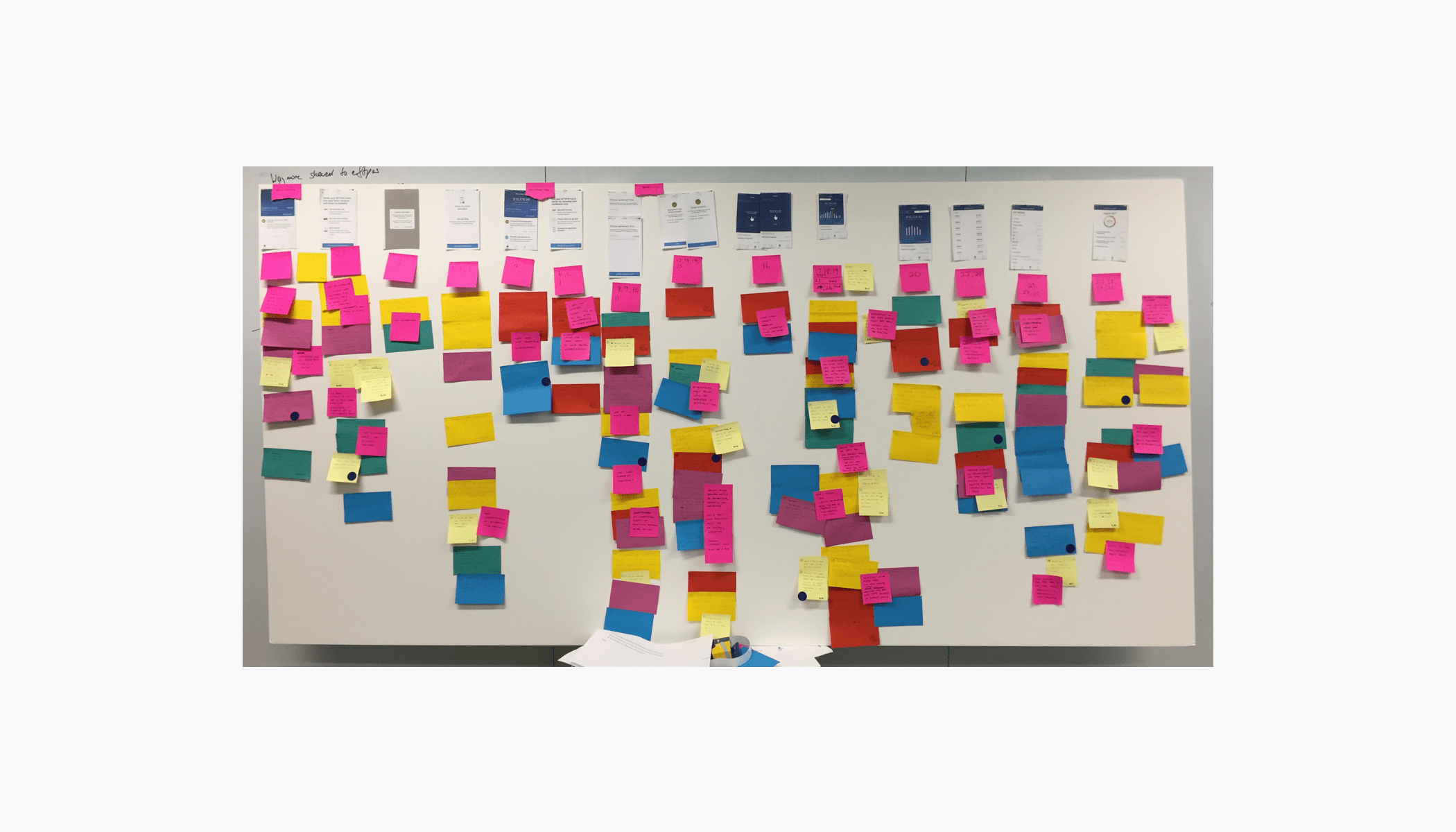
When all the sessions were done I put all the notes taken by my colleagues on a large board to help me analyse the feedback.
Main insights from testing
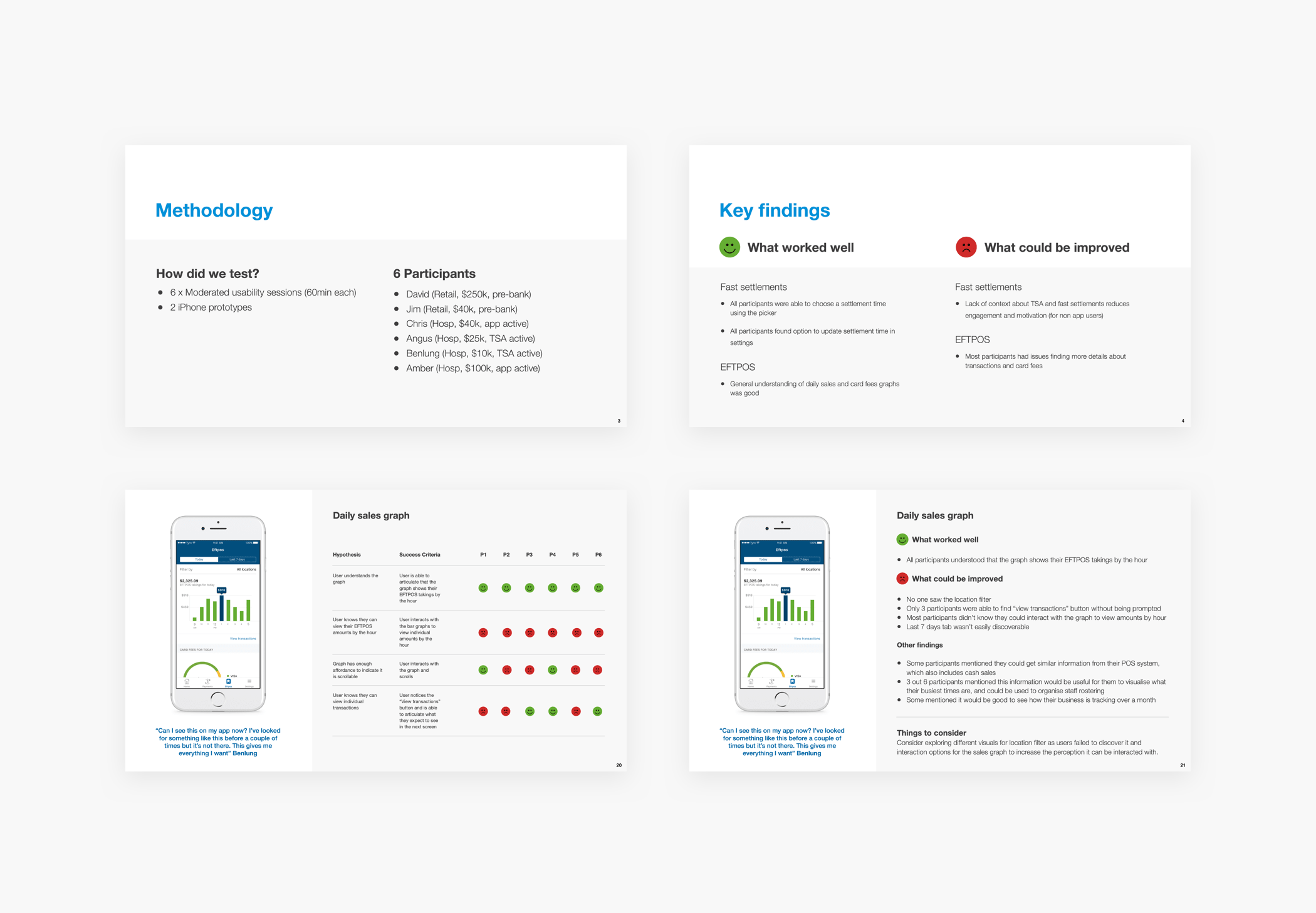
All users understood the value of the graph but none actually interacted with it. The “view transactions” button got a bit lost with the prominence of the graph and half of the users didn’t even see it. In the transaction list most users didn’t realise they could tap on a transaction to view more details. Nobody noticed the option to filter by location. The card fee graph was well understood, however, most users mentioned they wouldn’t necessarily need to look at this information every day, since it’s something they have no control of.
Final designs and testing
Based on the feedback from the first round of testing I made some changes to my designs. Most of the changes I made were related to visual hierarchy.
From the initial round of testing it was clear that the graph component was the most valuable element to users. I decided to make the graph section more prominent which then helped highlight other elements such as the “today and 7 days” toggle, and the location filter. I added coach marks to the screen to indicate to users they can interact with the graph, since that wasn’t discoverable in the initial designs. These would only appear the very first time the user accesses the feature.
I kept the card fee information, but moved the details to a different screen where users can access it at any time. On the transaction list I added affordance to each list item to indicate there’s more to see.
I organised another round of usability testing with 6 different customers to validate the updated designs and they were very well received.
A lot of customers found this feature to be extremely beneficial, and it helped to significantly improve usage of the app.
Usability Report
After every round of usability testing I put together a very detailed report with all the data gathered in the sessions in a format that was easy to understand. These reports were shared with all members of the team to communicate the learnings and actions needed to move forward with the project. They were also very useful for future reference.
Testing with high fidelity prototypes
This project was a great example that visual design is extremely important and can impact usability. I believe that when testing features on an existing product, high fidelity prototypes are the way to go. I like to give users the feeling that they are using the real app without thinking of it as a prototype.
I used this approach every time I tested new features in the Tyro App with users. When users are already familiar with the interactions and UI elements of an app, there is less distraction and it’s a lot easier to measure the success of new features.