Lead Product Designer | Domain | June 2022 – August 2024
Overview
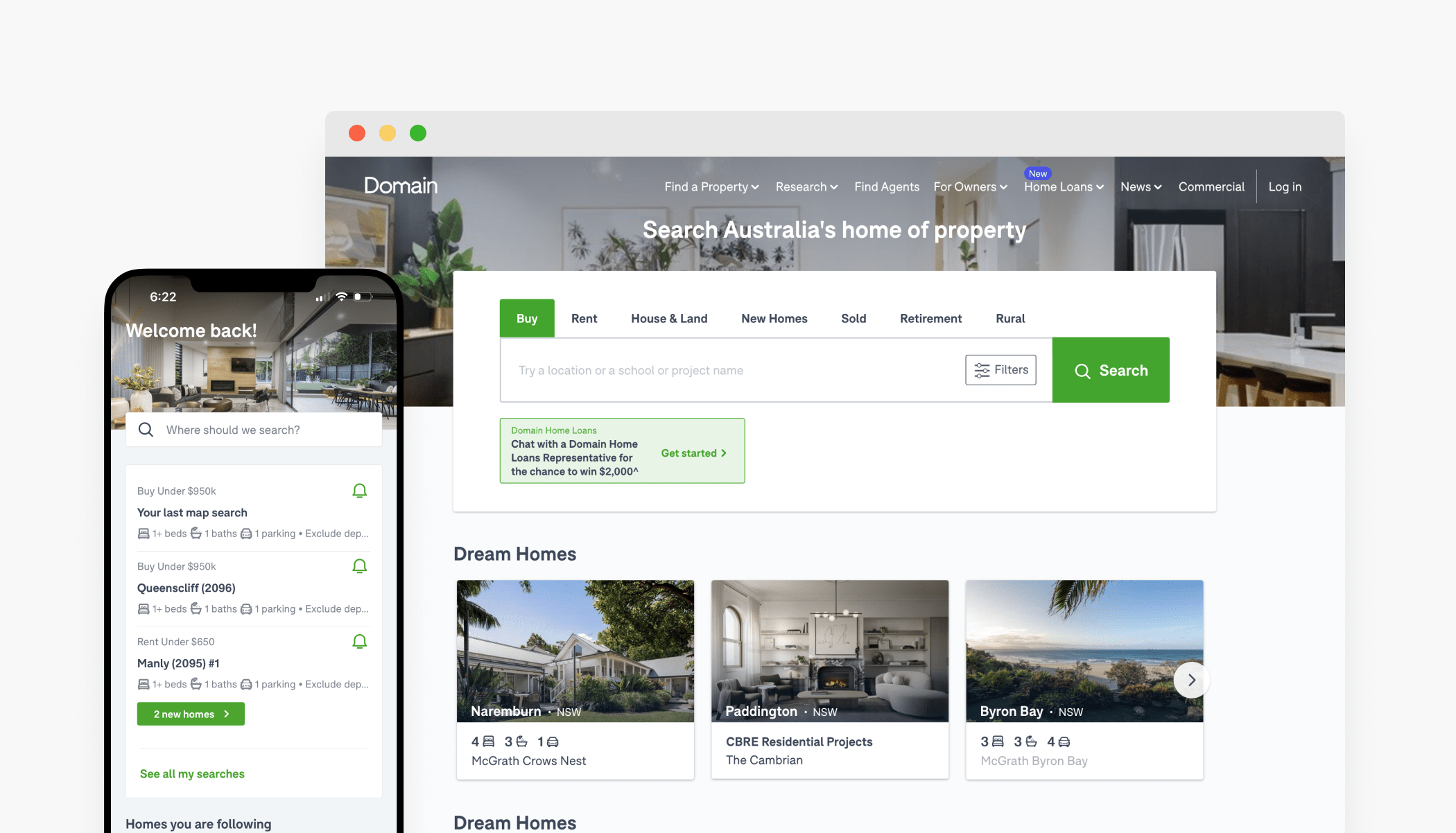
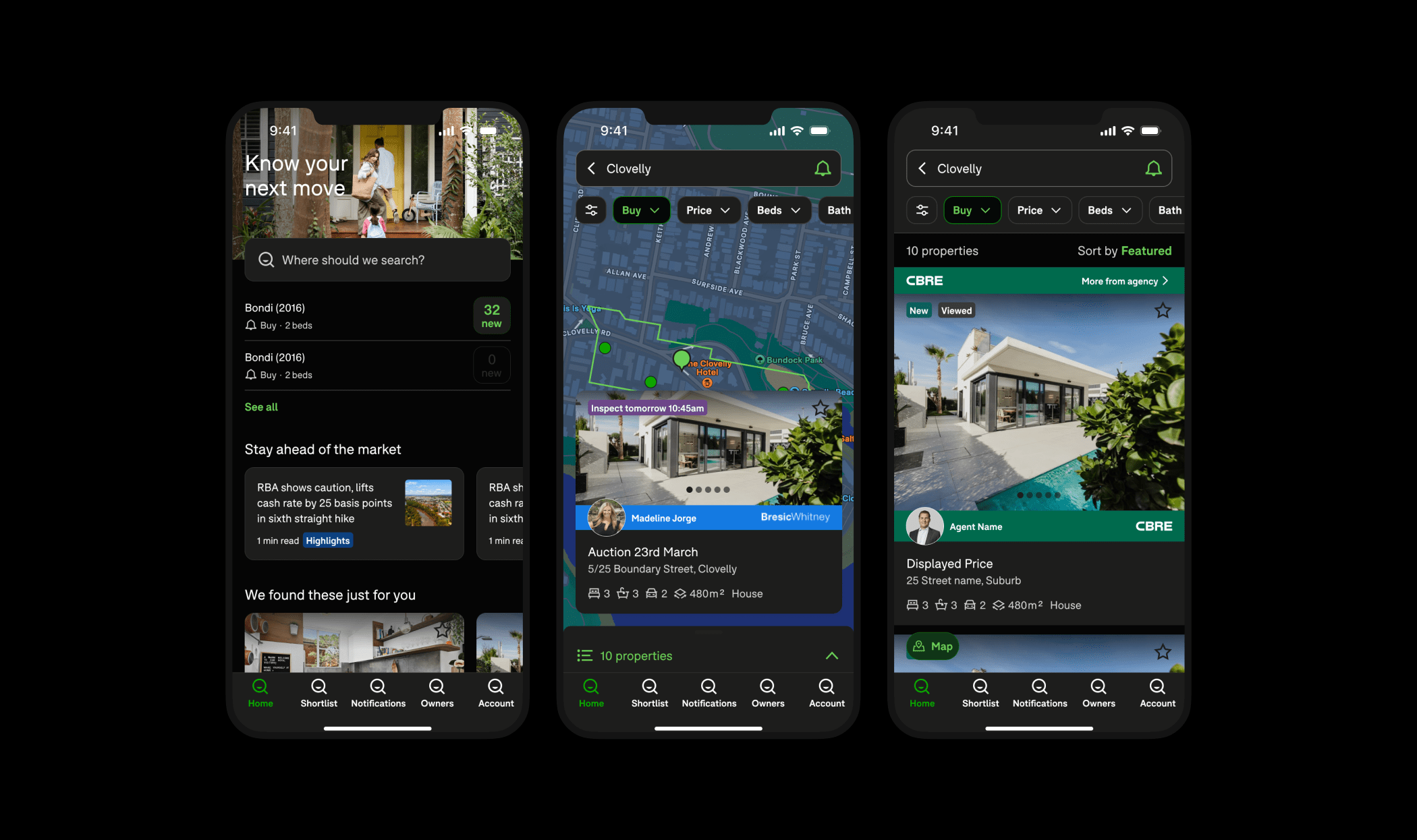
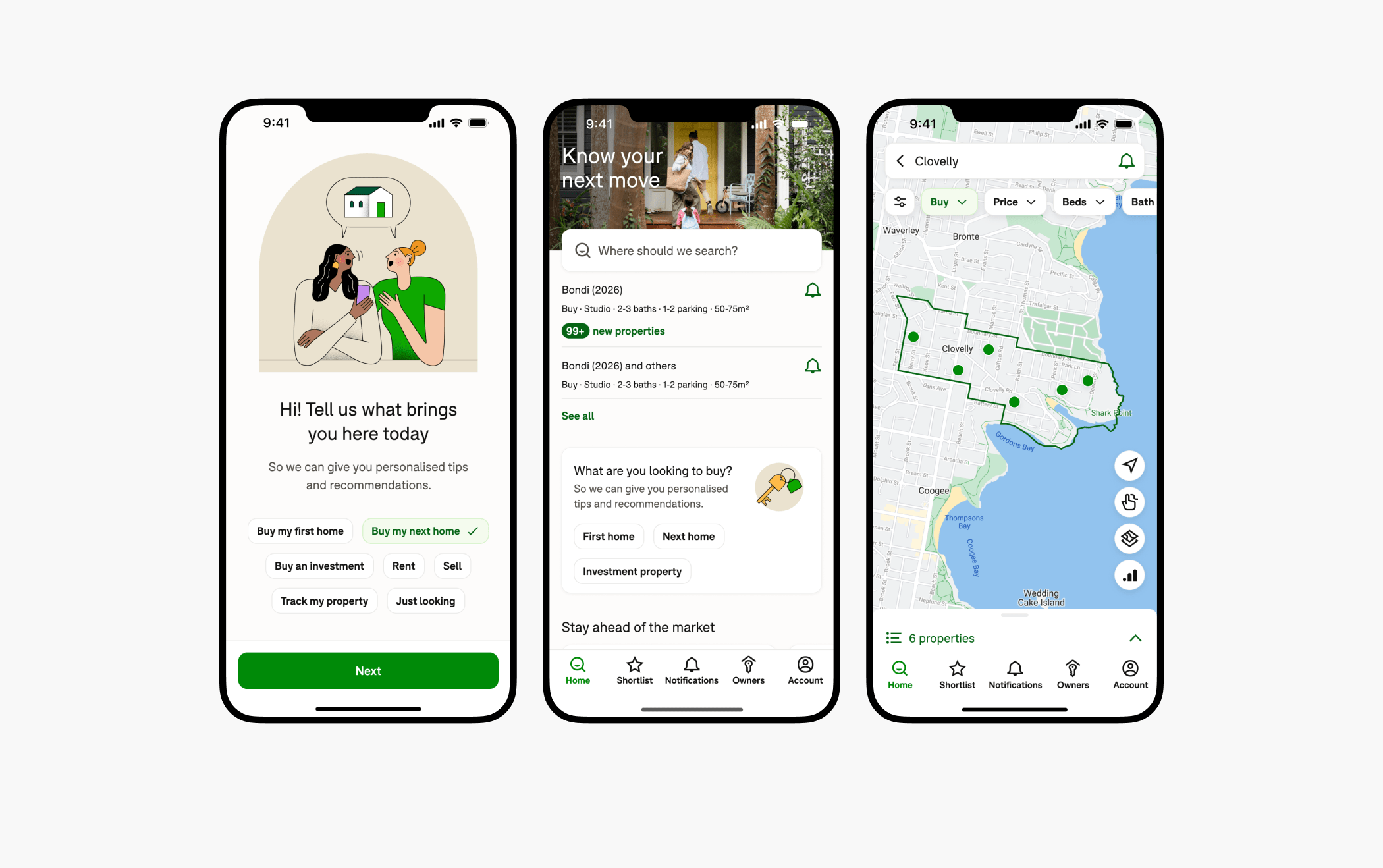
In 2020, Domain underwent a rebrand, but the updated brand guidelines had yet to be applied to the product. When we began redesigning and rebuilding the Domain mobile app, we saw this as the perfect opportunity to bring the refreshed identity into the product experience—modernising the UI, aligning app and web platforms, and building the foundations for a unified design system.
The existing product was dated—visually flat, container-heavy, and inconsistent across platforms. It didn’t reflect Domain’s evolution as a brand or the emotional weight behind the property journey. We needed to change that.
My role
I led a fast-paced two-week design sprint with three other senior designers to define the new visual direction. I facilitated daily workshops, guided the decision-making process, and ensured alignment across contributors. After the sprint, I carried the project through to execution—rolling out the new design, building the component library, and integrating brand assets into the product ecosystem.
Sprint process
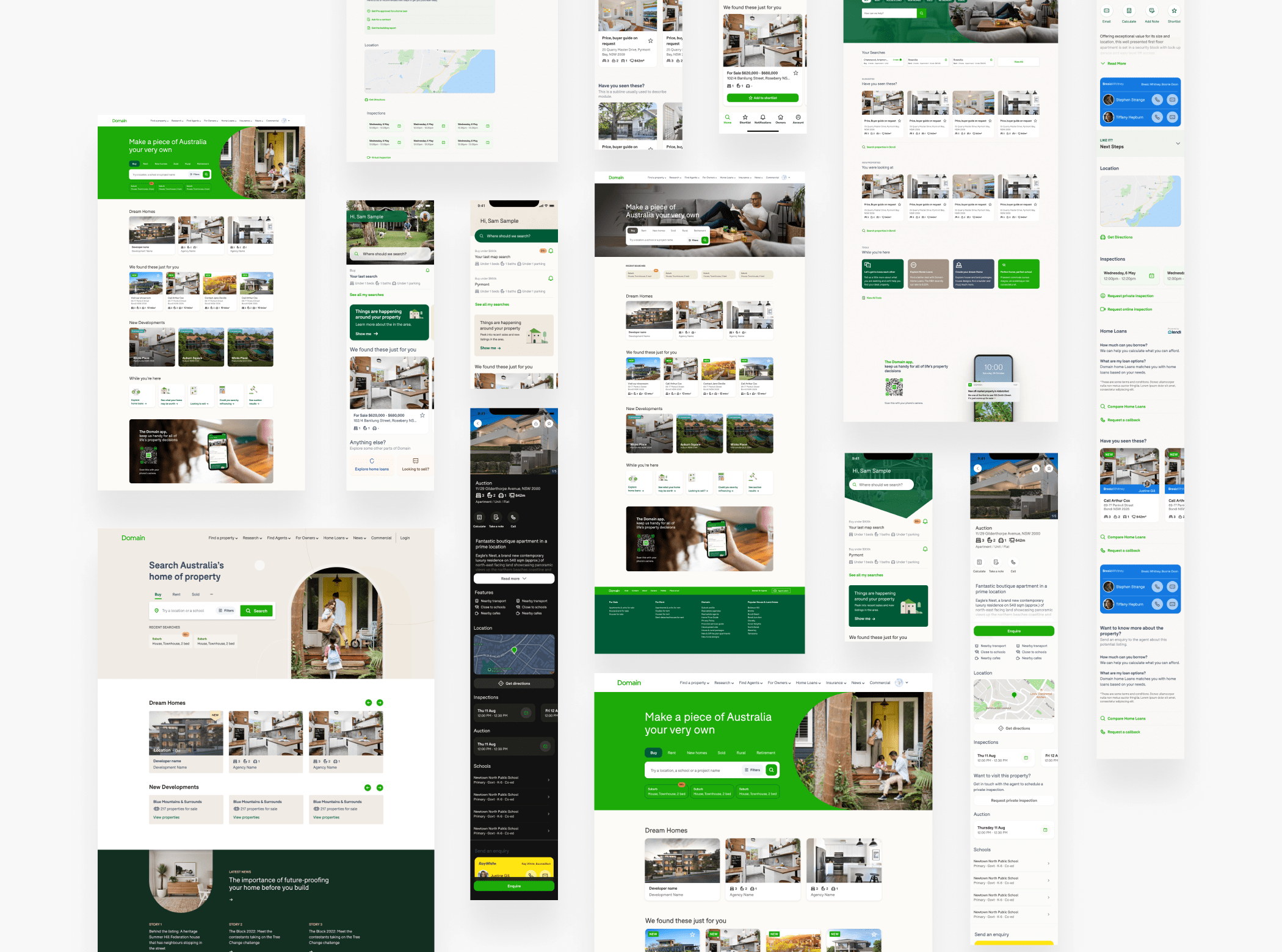
Week 1 – diverge & converge
We began with a diverge/converge approach. Each day, all designers (myself included) explored full-screen designs independently. At the end of the day, we’d regroup, review each other’s work, and agree on which elements to carry forward the next day. This iterative cycle created a sense of shared ownership and naturally aligned our design language by the end of the week.
Week 2 – focused refinement
Each designer took responsibility for refining a key screen (home, search, listing), with daily feedback loops to maintain visual consistency. I ensured patterns were being applied consistently and guided design decisions back to our core principles.
We presented the final outcome to the Head of Brand at the end of the sprint - it was very well received and set the foundation for a wider product refresh.
Design principles applied
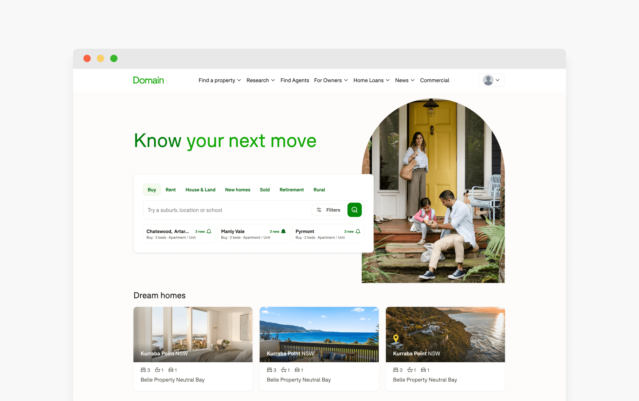
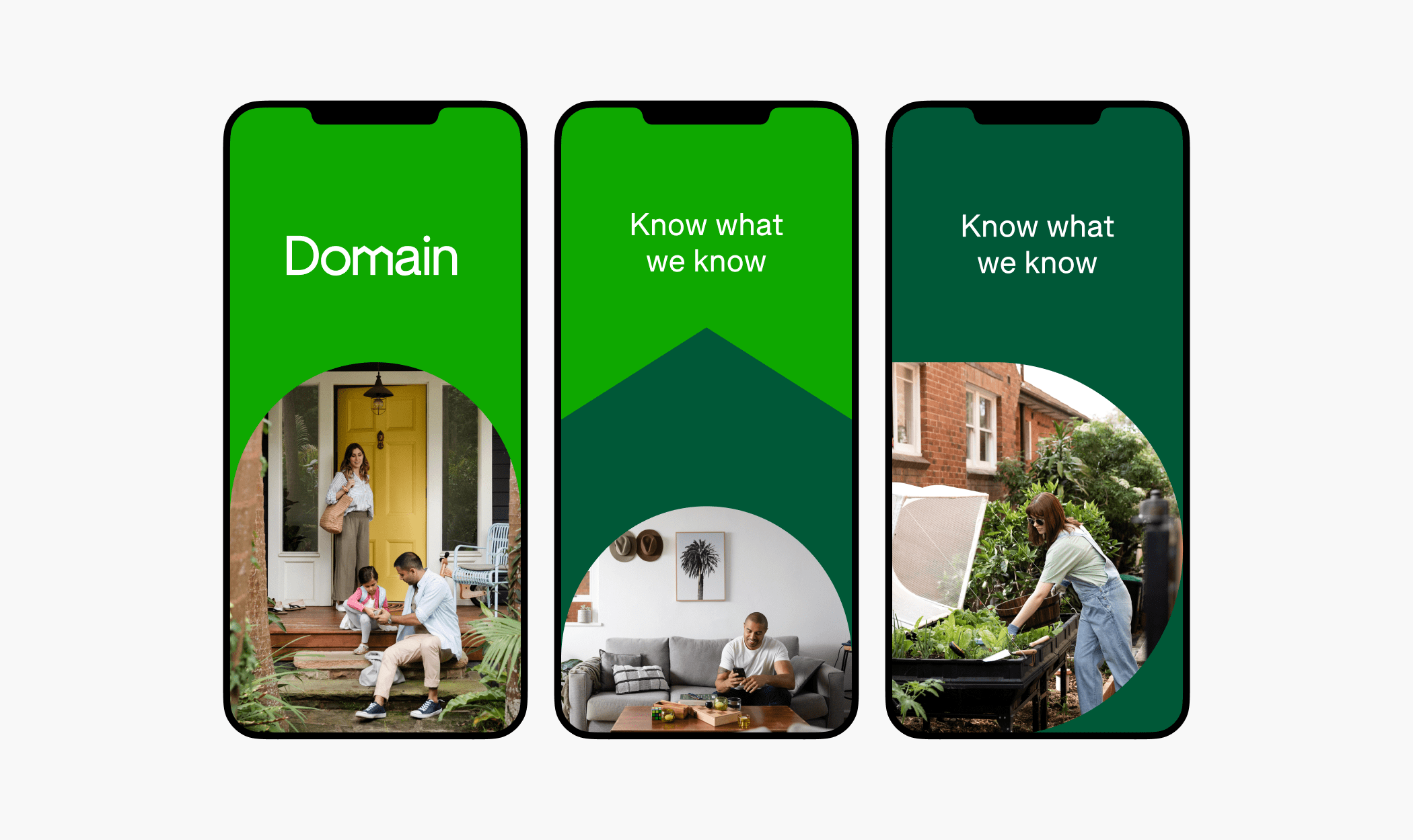
More human
We wanted the product to reflect the emotional reality of the property journey—not just utility. We used lifestyle photography to bring warmth into the interface, making it feel more human and relatable.
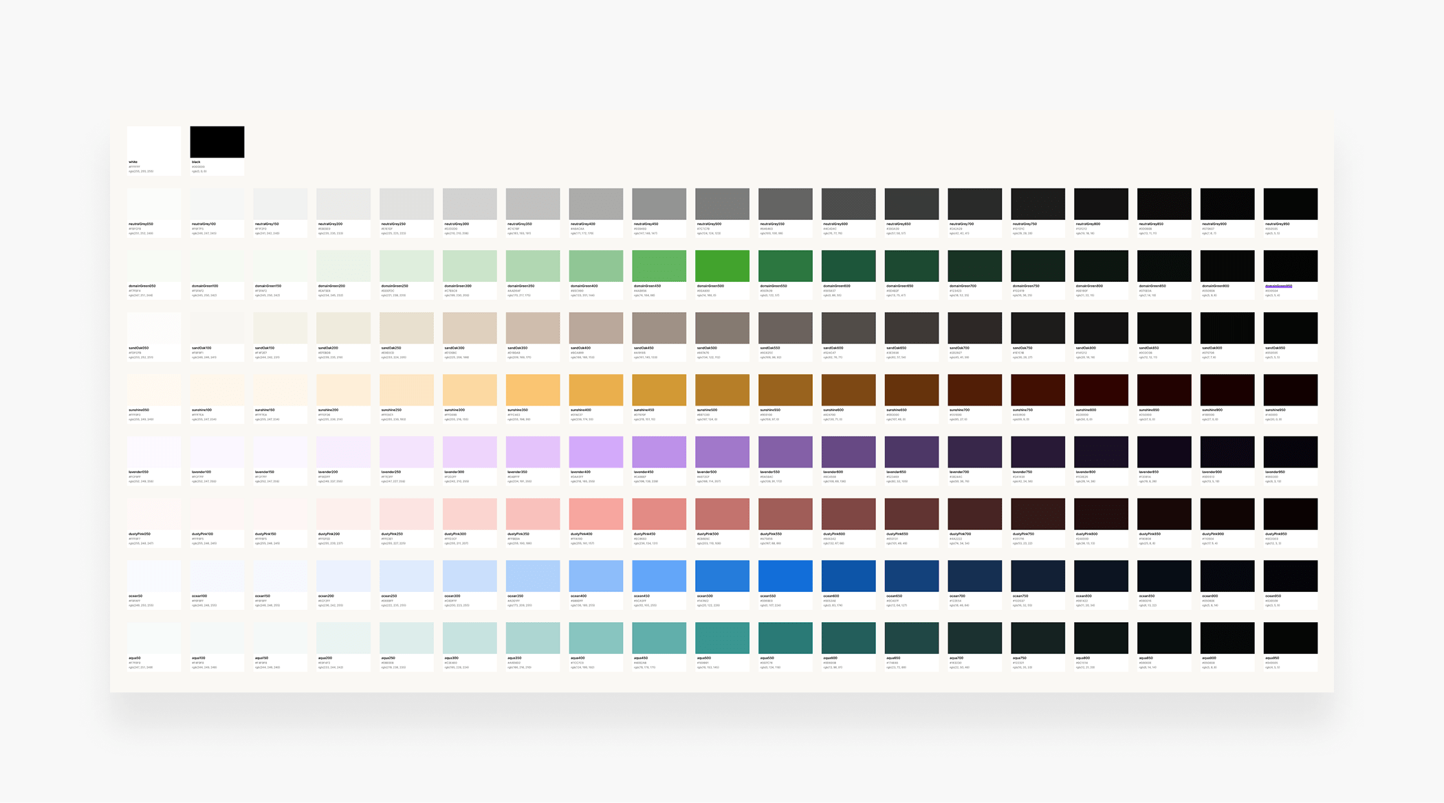
Expanded, accessible colour system
The original brand palette wasn’t designed with digital accessibility in mind and lacked the flexibility needed for complex UI states. I expanded the system using Adobe’s Leonardo.color tool, generating 20 accessible shades for each core colour. We also introduced new accent tones for elements like alerts and badges, and mapped all colours to our design tokens to ensure consistency across platforms.
Dark mode integration
With the expanded palette in place, we were able to build a robust dark mode for both iOS and Android. The extended range of shades made it easy to create sufficient contrast between surfaces, text, and interactive elements.
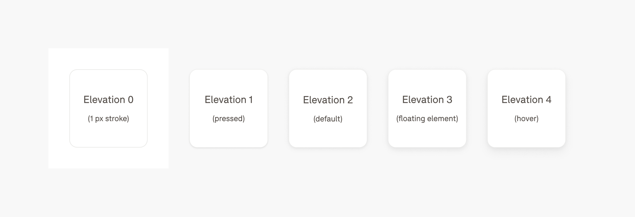
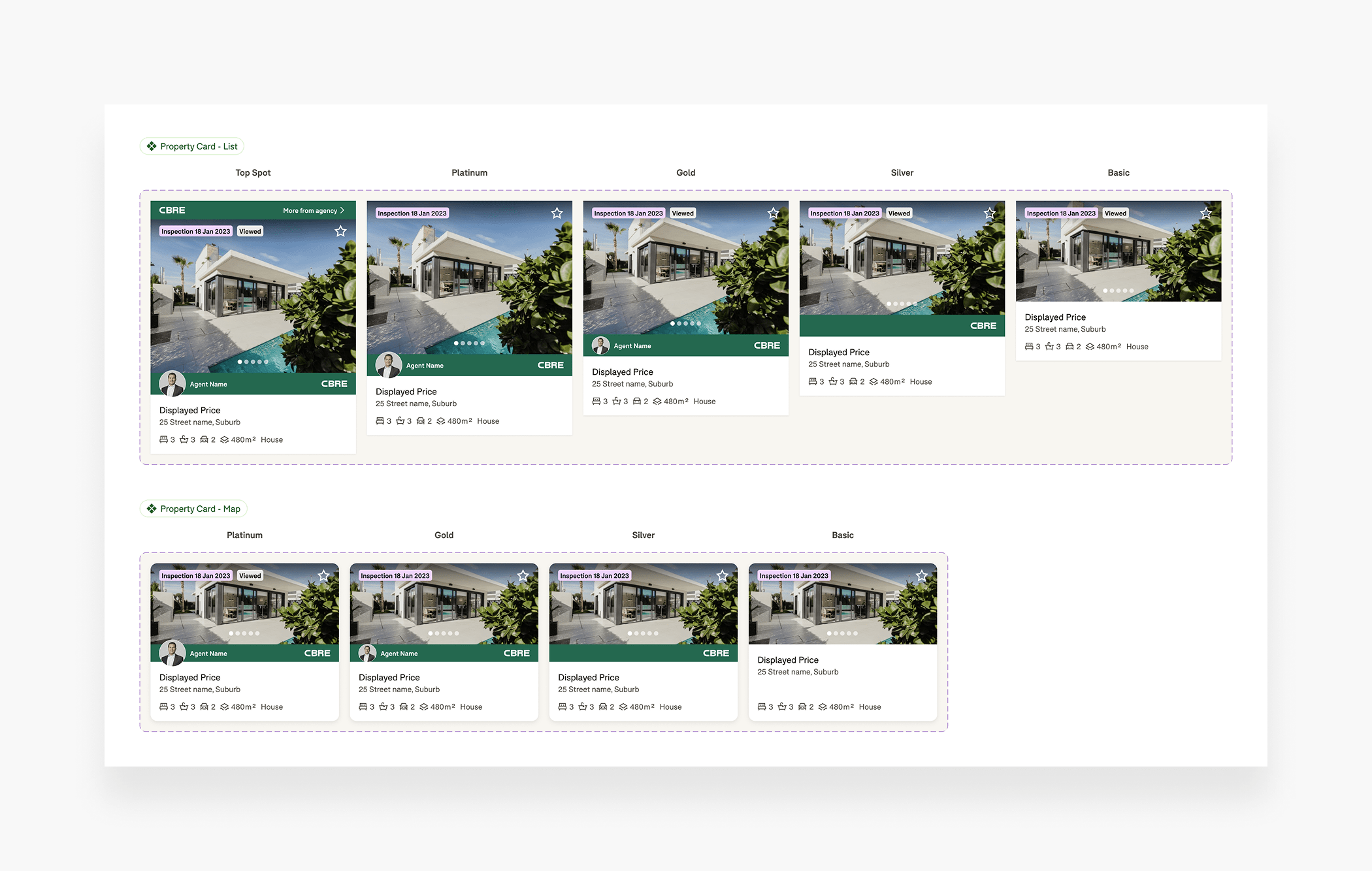
Elevation
To add depth and reinforce interactivity, I introduced a consistent shadow elevation scale. This helped convey tactile feedback without overwhelming the interface.
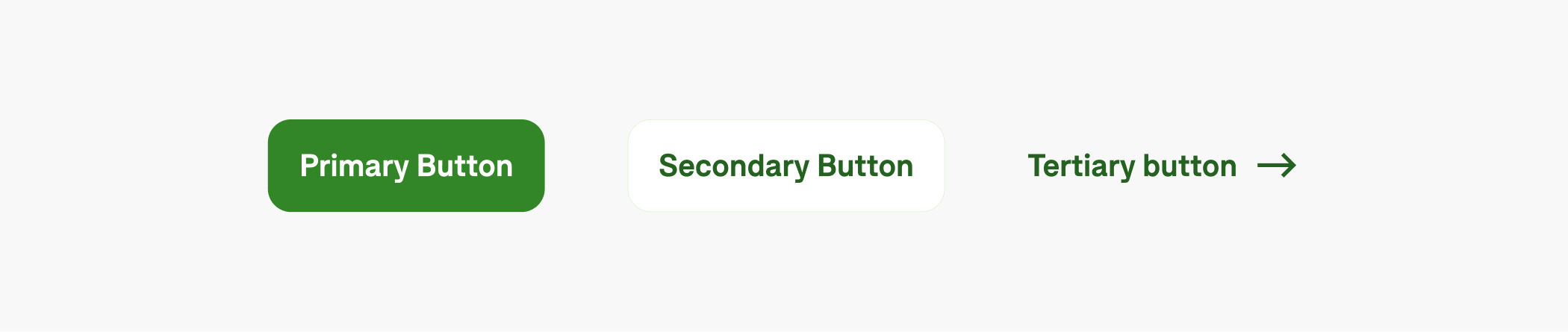
Better CTA hierarchy
To reduce visual noise and improve clarity, I redesigned Domain’s CTA system, which previously overused the primary green button. I introduced a clear hierarchy: a green primary CTA (limited to one per screen), an outlined secondary CTA for supporting actions, and a tertiary text link for lower-priority tasks. This structure made it easier for users to identify the key action on each screen and improved overall consistency across the product.
Softer, rounded corners
We replaced harsh edges with rounded corners to reflect a friendlier, more contemporary design style.
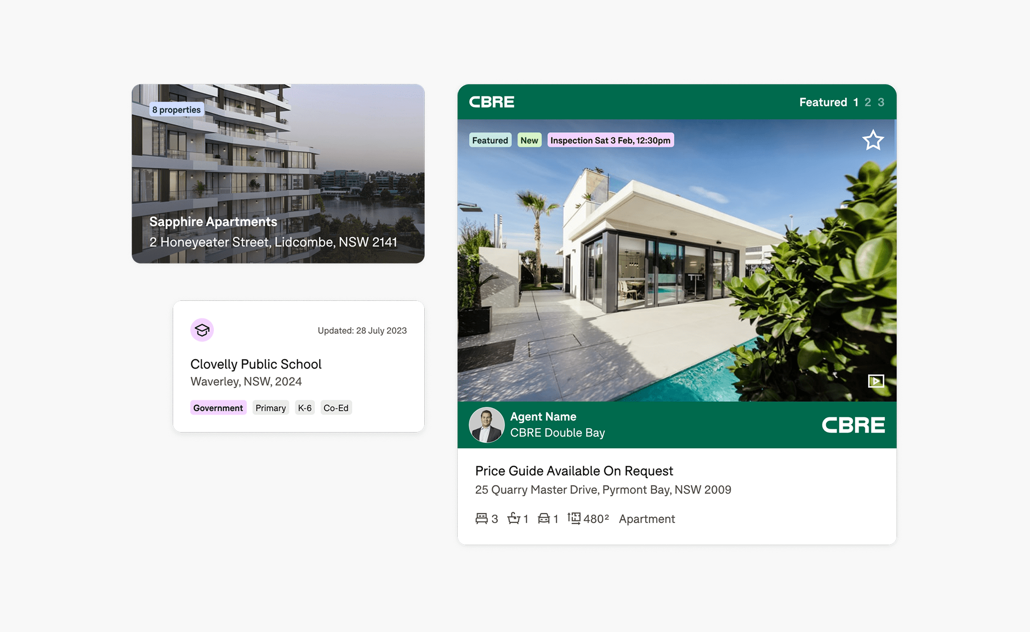
Portal shapes as a brand device
Domain’s logo is made up of four portal shapes. We brought these into the UI to frame imagery, inspire iconography, and guide illustration styling—subtly reinforcing brand recognition without being intrusive.
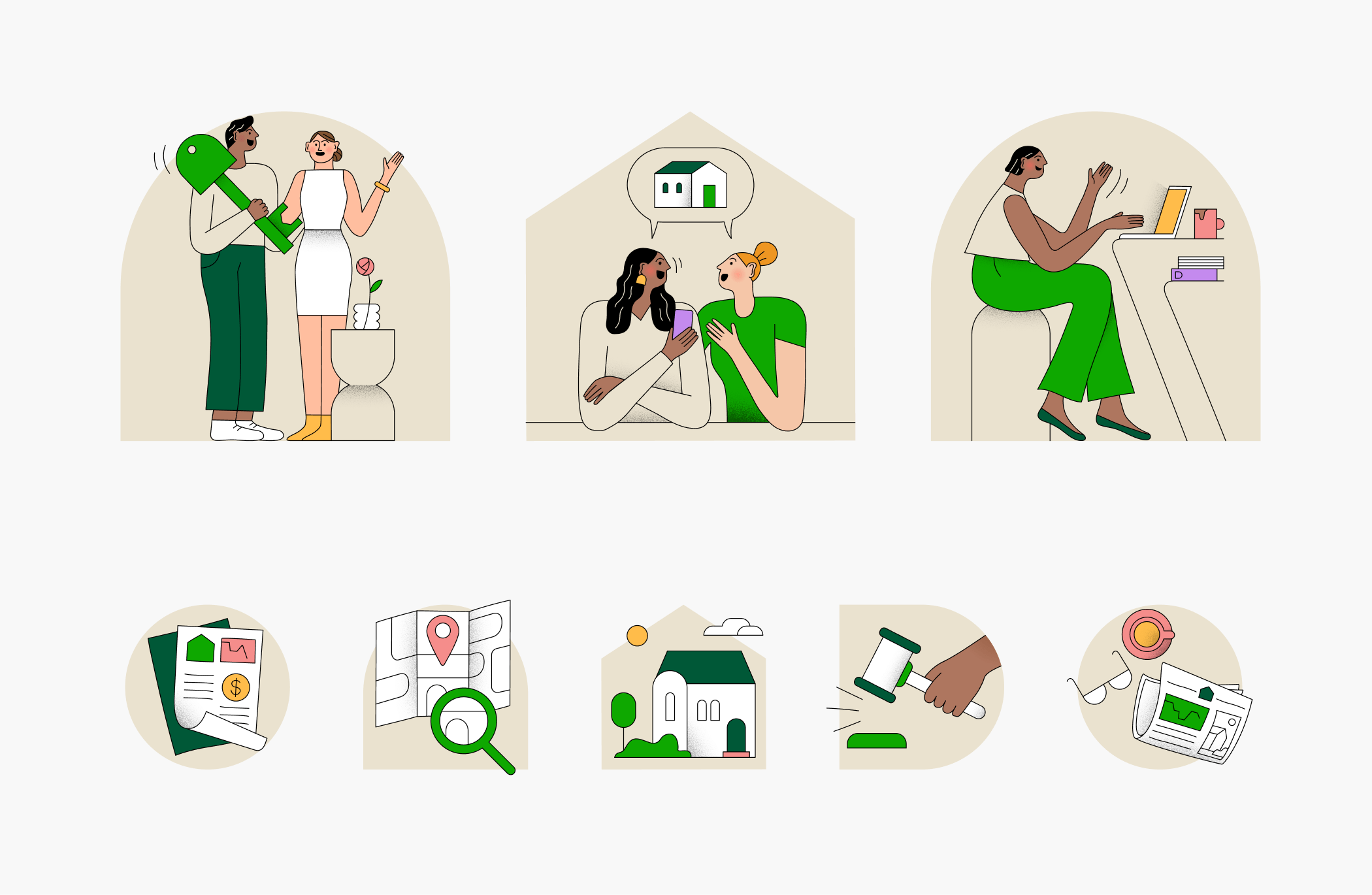
Custom illustration library
Post-sprint, I worked with an external agency to develop a custom illustration set. The project had its challenges—working through an account manager slowed progress and diluted feedback. Once I established direct contact with the illustrator, the work accelerated and the quality improved significantly. I curated the final set and built a shareable Figma library for the design team.
Execution & impact
Cross-platform component libraries
I built new iOS and Android component libraries from the ground up, embedding our new colour tokens, typography styles, spacing, and interaction patterns. These libraries made it significantly faster for designers to build new screens and ensured visual and functional consistency across platforms.
Product-brand alignment
This work aligned Domain’s product experience with its brand promise for the first time in years—closing the gap between marketing and product, and enhancing brand trust. The updated UI helped create a smoother, more emotionally attuned experience for users, setting the tone for future updates and improving the perception of Domain as a modern property platform.
Outcome
Set the visual foundation for the next generation of Domain’s products
Delivered a scalable, cohesive design system that empowered the wider team
Created a more empathetic, brand-aligned experience for users
Streamlined design velocity through component libraries and shared assets